Why the right colour scheme is important where we work.
Why the right colours and colour combinations also matter in our offices – an excursion into the psychology of colour in office design.
Why is it important to pay attention to the right colours and colour combinations when designing an office? “Colours are displays of feelings,” says the psychologist, philosopher and colour advisor, Max Lüscher. And colours really do have an effect that is more that just what we see. They influence our minds, our moods, our feelings and the way we behave. Colours can calm us down or make us restless, they influence bodily processes such as metabolism, hormone levels, heart rate, pulse rate and breathing rhythms. We can perceive certain colour combinations or gradations as loud, quiet, intrusive, subdued, hot, cold, soft or hard.
Consequently, the colours when designing office space should not be left to chance or exclusively to the subjective taste of the person who chooses the furniture.
As, ultimately, they have an impact on employees’ productivity. An office atmosphere can be inspiring, creating and supporting enjoyment in what we do as well as promoting productivity and creativity. Colours can be used in different ways when designing offices, for information or as a signal, for instance, or as a help with orientation, indicating different areas or warning of dangers.
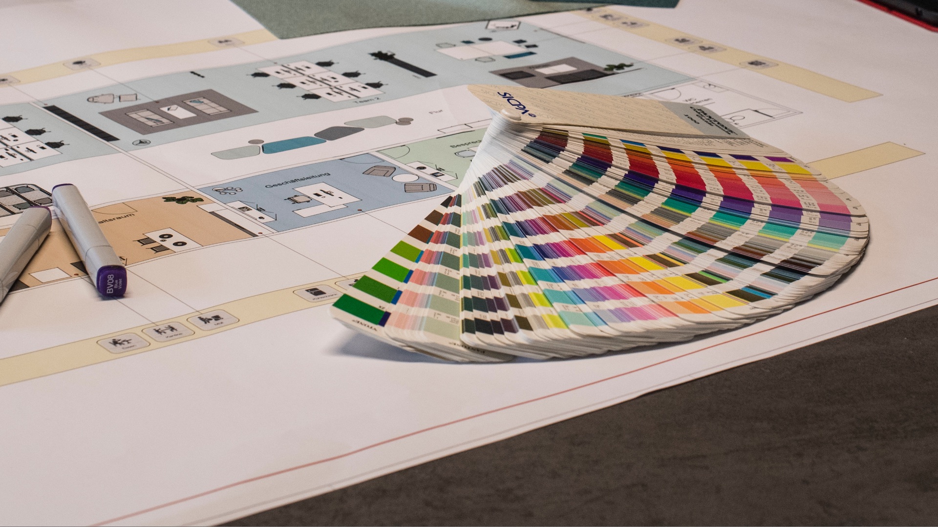
The secret of colour combination
Individual taste does of course play a major role in the colour scheme for furnishing offices – it’s important, after all, that employees feel comfortable. When designing offices, however, certain rules should be followed with colour. This is where the ASSMANN planning professionals and their specialist trade partners are always on hand with advice and help to get the very best selection of colours.

When planning office spaces, any visual disturbances, concentration difficulties and signs of fatigue can be avoided through the use of light and colour.
The brightness of different surfaces and objects should be within a similar range. So dark work surfaces should be avoided, as they contrast strongly with paper lying on them, just as much as glare caused by lamps or daylight. Also a significant role is played by the number of colours used, the range of colours selected, the ratio of surfaces to colour and the position of particular colour surfaces. A balanced colour design avoids exposing users either to monotony or to sensory overload. A few coordinated colour tones with different colour saturations and shades of brightness establish harmonious contrasts that are pleasant to see.
The ergonomic effect of colour
The ergonomics of colour should not be ignored. This makes a distinction between ergonomic accent colours, surface colours and room colours. Ergonomic accent colours are all primary and secondary colours, black and brown as well as the corporate colours of a company. They can be used in small areas of floors, chairs and accessories. Ergonomic surface colours include white, beige, light violet, light blue, light green and medium grey tones – and they are suitable for large areas. Ergonomic room colours are white, pastel shades and very light greys to provide background tones for walls and ceilings.
If ergonomic considerations are taken into account when designing office spaces, dark colours should be selected for the floors, while lighter colours would work better for the walls as they make rooms look bigger. The ceilings can then be given a shade that is slightly lighter than the wall colour. This still leaves enough options open for individual colours to stand out, so the choice of colours still bears an individual signature.